
unit 7_ interactive investigation ual_final
You have two weeks to produce an online presence for a brand new production company.
PART ONE
SHARP Films
http://www.sharpfilms.co.uk/page/home/

The first thing I noticed about SHARP FILMS website is the clean and professional feeling that you instantly get from opening the site. Along with the brand name the site has a clear and simple design showing exactly what the company does and how to get in touch with them. At top of the home page there are clear tabs indicating the different pages making it quick and easy to find the information the client or customer is looking for. This feature gives off a professional and smart feeling about the website giving a leaving a good impression of the company.
Another factor of the site that I personally really like is the fact that at the top of the home page is a constant loop of SHARP FILMS showreel, a short series of clips containing examples of the production company’s work for showing to potential employers. This is very effective for attracting new clients as it shows the best company’s best work making them seem more appealing to there customers. As well as this it displays their works showing what genre of films there skilled at making demonstrating there specialties so clients can get the best quality films out of there work.
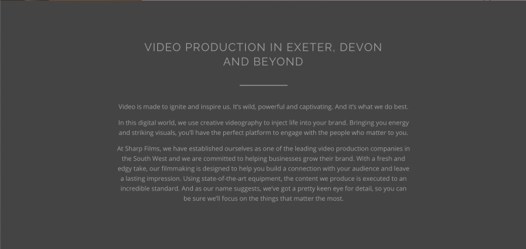
The home has a brief description of the video production company. The description above describes the motives of the company and what they hope to achieve. Also giving future clients a brief look at the work ethic and personality of the creators showing how they are passionate and dedicated to creating the highest quality of videos for their customers. The paragraph makes me feel like the producers want to make a video to benefit the company it represents in the best way.
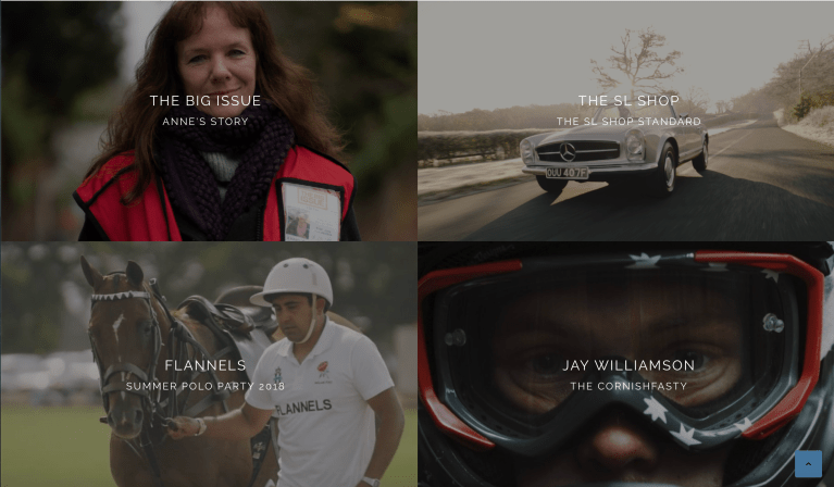
At the bottom of the page it shows the companies most recent works again to show the kind of videos produced by SHARP FILMS. This section shows how the company are staying active and keep making videos for a large variety of clients.
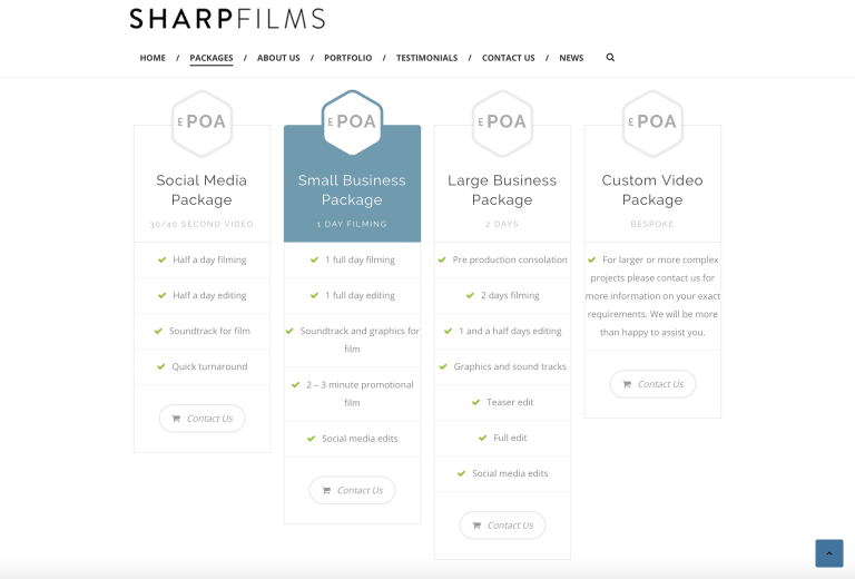
Under the ‘PACKAGES’ bracket on the SHARP FILMS website, the creators have clearly set out four separate deals appealing to different companies. This is one of my favourite features of the website as it clearly states the different items included in the different packs making it clear for clients to see exactly wha their purchasing and what package fits there company the best.
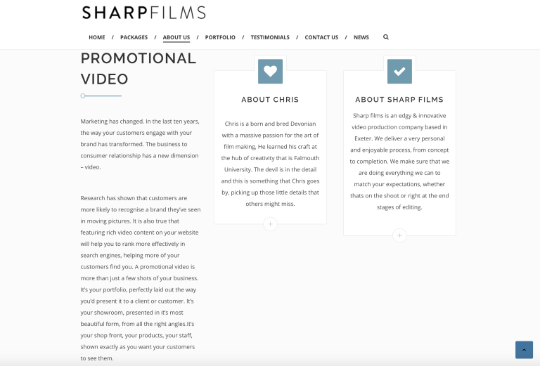
Under another bracket of the website is a section ‘ABOUT US’ is dedicated to explaining more about the creators and the production company. This includes personal information, this is to make them look more appealing and friendly giving the client an insight to them making the customers feel as if they can trust in SHARP FILMS more.
This tab also explains more about the company and what to expect when working with them, claiming a personal and enjoyable process when making their products. Making them appear more relatable and reliable by giving off the feeling of guaranteeing great service with an enjoyable experience and high quality video. These factors are reinforced review and experiences from previous customers.
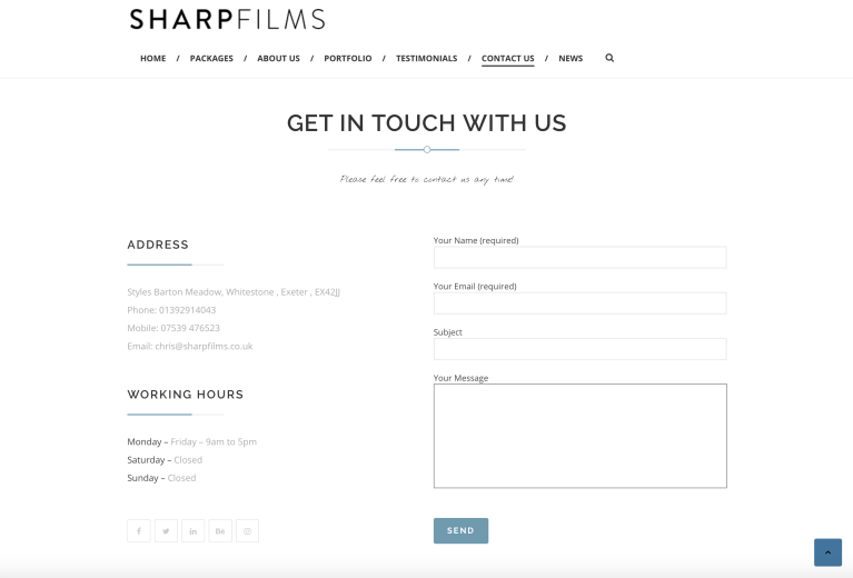
For the final aspect of the SHARP FILMS website is the ‘CONTACT US’ bracket which is a page of contact information, location and working hours. What I like about this is that the creators have kept the page very clear and simple showing the right amount of information so it’s not confusing but straight forward.
Summary
The strengths of this website is the fact that it clear and simple but professional, showing the information required such as contact info, portfolio, creator info as well as having a stylish and efficient design. This makes the website easy to navigate and use showing potential clients what they need to see.
The weaknesses of the website are the use of colour being predominantly black, grey and white. The problem with these colours is they don’t grab the attention of clients as these colours are often associated with background colours and and are easily overlooked by not standing out. On SHARP FILMS ‘ABOUT US’ page they clam to be ‘edgy and innovative’ although they use duller colours and instead of more noticeable colours to distinguish themselves. This could be a design aspect as they want to have a slick feel however personally it doesn’t appeal to me. Although I’m not the target audience for the production company and the colour palette would appeal more to the audience its tailored after.
Foxwell Films
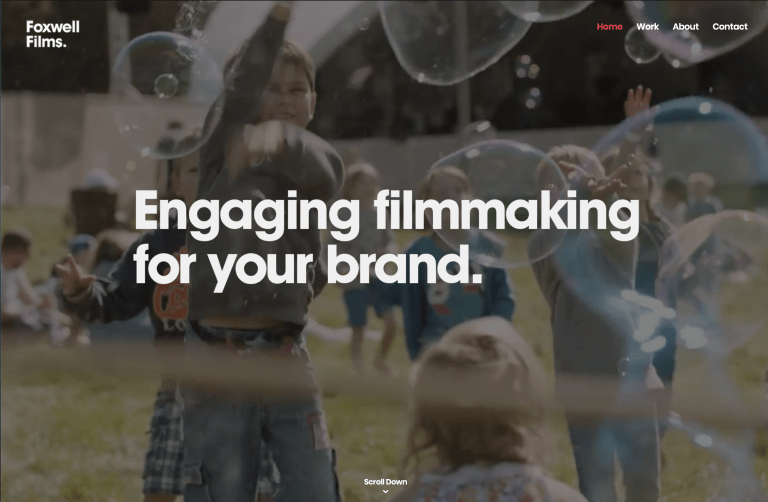
The first that I noticed about Foxwell Films is that at the top of the home page the creator had clips from his showreel on a constant loop overalled with some text. This feature appears to be a recurring theme within production company websites. The showreel shows a series of light hearted and happy clips showing a theme throughout the creators work. Under the opening page is a link to Foxwell Films full showreel with a short paragraph describing the importance of film and some brief information on the Will Foxwell the creator of Foxwell Films.
The design of the opening page is simple and basic but also neat and efficient sharing a lot of similar traits with SHARP FILMS although I. feel that the Foxwell Films website has a much lighter feel to it. This is due to the fact that the previous website had used a lot of black, greys and whites, whereas on this website Will Foxwell has had a short showreel take up a large majority of the home page with brighter colours.
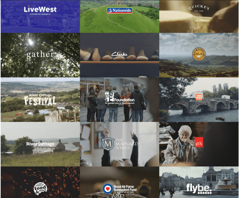
The design of the Foxwell Film portfolio page uses a compact mosaic tile style to display his many corporate videos he has made over his career. I think Will Foxwell has used this layout to show off the large amount of projects he has worked on emphasising the large amount of experience he has of working within the industry.
The layout looks professional and does successfully give a feeling of a lot of work, however I only think this design works when there is a constant amount of projects to fill the empty gaps for example if Foxwell Films produces another film there will be two white blank spaces left on his portfolio this takes away the professional feeling.
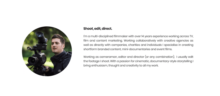
Foxwell Films ‘about me’ page is a lot small and more to the point then SHARP FILMS with a brief description of Will Foxwell’s experience and clients he often works with. As well as that he describes the skills he is qualified at such as working as cameraman, editor and director. Another similarity I found with SHARP FILMS is that both professionals have a strong passion high quality storytelling through films and video content.
The design of this page is straight forward and simple but does the job of telling clients about himself.

The ‘contact’ page for this website has a more layer back approach and a lot less professional than the SHARP FILMS page however short and to the point following that theme throughout the website.
The design is also basic with small text indicating where the to write messages, as well as contact information.
Summary
The strengths of this website are the facts that its straight to the point and only showing clients what the need to e.g. experience, past work and contact info.
However I feel like this is simple and laid back design gives off a bad impression as if it reflects on there work which might put off potential clients.
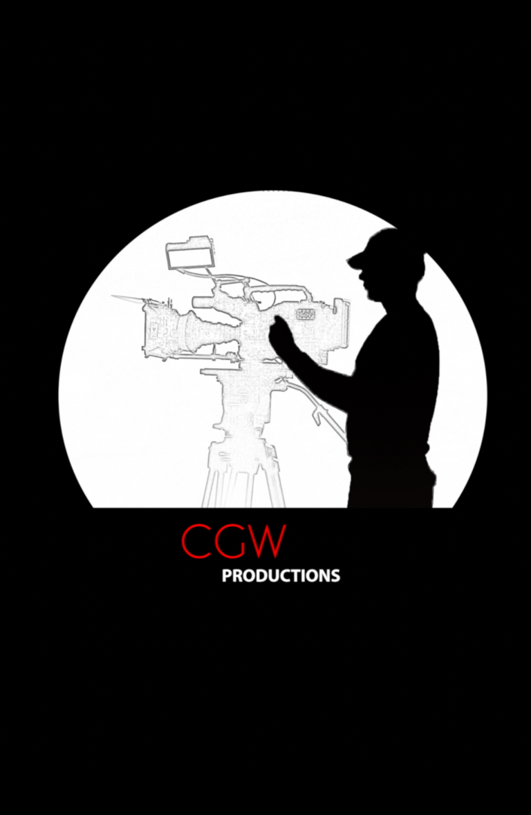
MY LOGO
Idea
I want to create a wide variety of films from travel travel videos to corporate videos so I need a logo that reflects this with an edgy and cool look to show the travel side, but still maintaining a professional feel.
Name
At first I wanted to make the name of my production company something related to film so people would instantly know what the company did. My first idea was to call the company Bird Eye Productions but there were already three other companies with that name, so I spent more time searching for a film related name however couldn’t find something that fitted the style I wanted and was untaken. This lead to me settling on using the enshilles and putting films at the productions at the end of it.
Logo
1st Draft
At first I was really happy with this logo and thought it fitted the style and themes I wanted to go for. However I wanted another opinion and sent it to a graphic designer I know for some advice. He told me that it was too complicated for a logo it needs to be able to be seen from far away and still recognisable which this logo was not.
2nd Draft

After taking this advice on bored I tired to create a logo that was lot simpler and was able to see from far away. At the time of making this logo I just wanted to corporate videos and wanted a logo that reflects a classy and professional look. After making this logo I searched for any similar logos already made and found that very similar logos had already been used be many different companies, as well as that the logo doesn’t reflect anything to do with filming.
3rd Draft
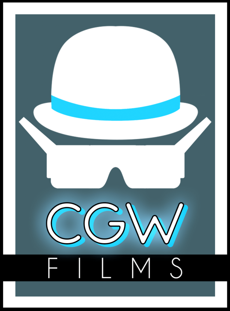
I really wanted to keep the blower hat to show the corporate side of production company however wanted to make it standout and more fun as now I wanted to make travel videos as well as corporate. I think this logo is perfect for this as it looks fun and edgy but also looking clean and sharp fitting the brief I had set for myself.
Finale Logo
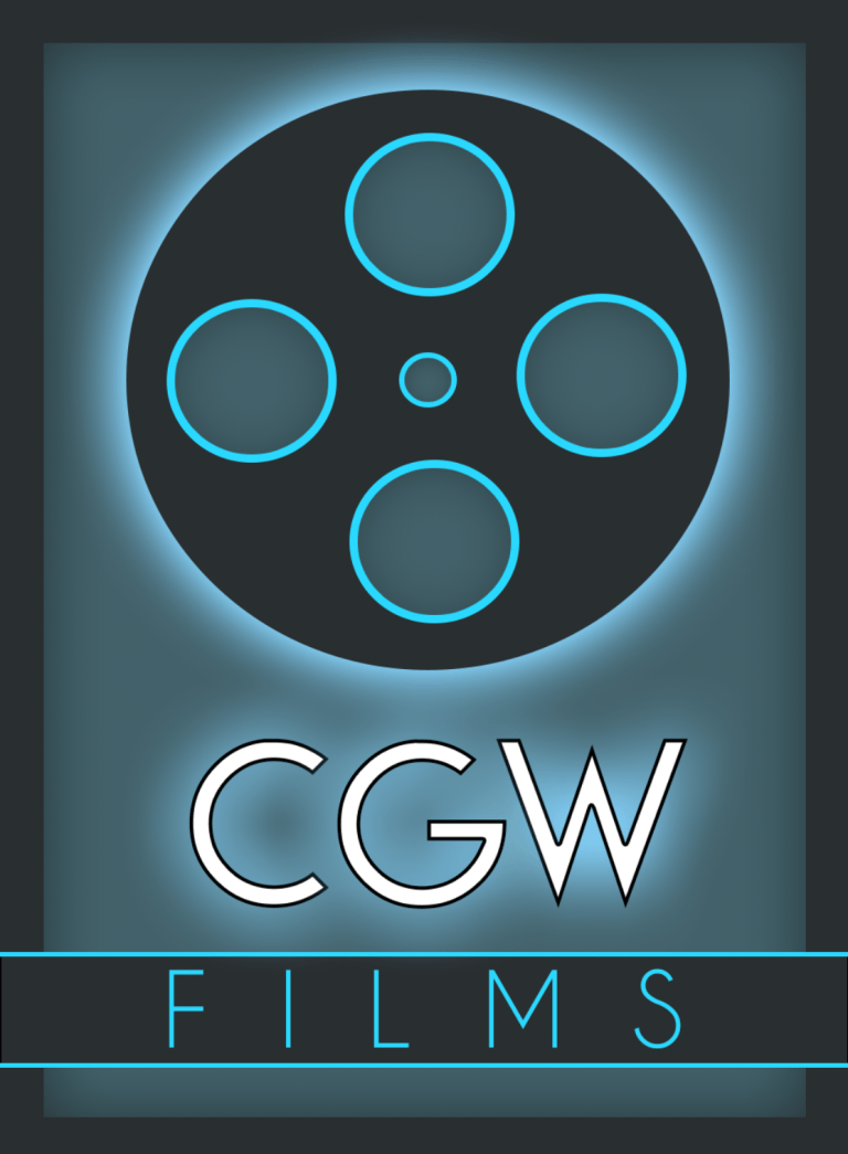
This is an upgraded version of the pervious logo as now it shows a film reel instead of of the previous icons I made this change because I felt the last logo was a good concept and roughly fitted what I wanted although wouldn’t work in a working environment. Whereas this logo looks professional but stylish as well as that which is what I wanted.
Mission Statement
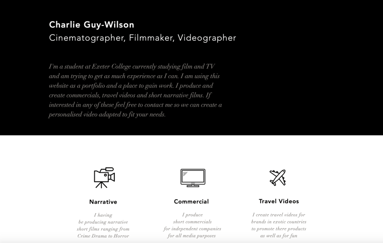
I’m a student at Exeter College currently studying film and TV and am trying to get as much experience as I can. I am using this website as a portfolio and a place to gain work. I produce and create commercials, travel videos and short narrative films. If interested in any of these feel free to contact me so we can create a personalised video adapted to fit your needs.
Business Plan
I will approach small businesses in need of a video and ask to film at a low price depending on the length of the filming or different packages. I also reach out to companies needing travel videos for products or clothing pieces will vary.
Contact me for any further details or negotiation
email – cguywilson@outlook.com
phone –
Full Package – £100 :
- Pre-Production consolation
- 1 day of filming
- 1 and half day’s of editing
- Soundtrack and sound effects
- 2-3 minute promotional film
- Social media edit
- Up for negotiation
Half Package – £50 :
- Half day of filming
- Half day of editing
- Soundtrack
- 1 minute video
- Up for negotiation
Quick Package – £20 :
- 3 hours of filming
- 3 hours of editing
- Soundtrack
- 30 second video
- Up for negotiation
Investigation
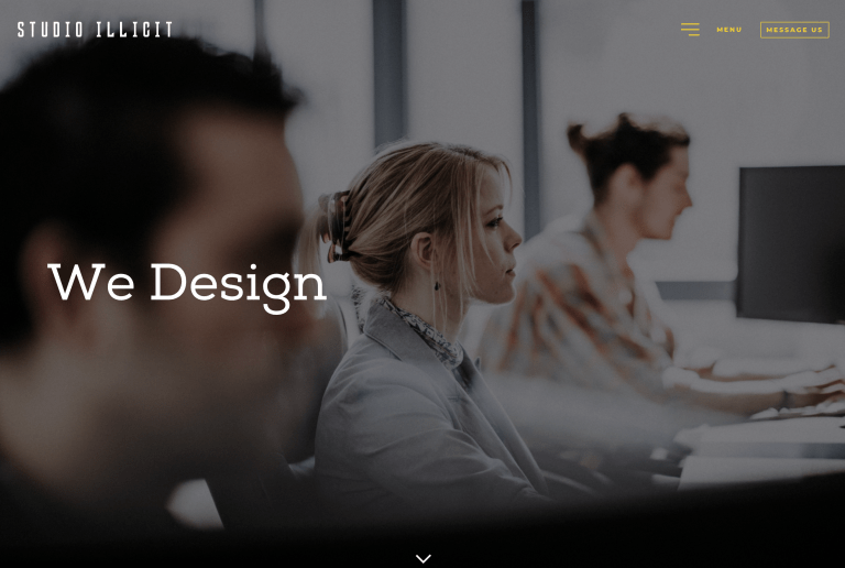
ILLICIT is a Exeter based corporation that make digital products from brands to websites create powerful digital experiences. On ILLICIT’s website the company states that have two goals, good design which gets noticed, and smart back-end technology which drives results. This company produces high quality brands and websites so business can take their companies to the next level of professionalism.
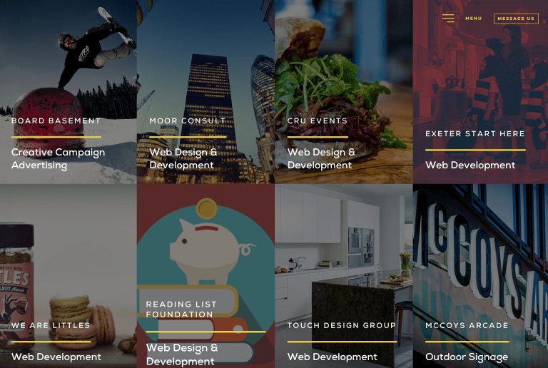
ILLICIT have worked for a large variety of companies listed on the portfolio bracket STUDIO ILLICIT website. The studio has worked with companies such as ‘Kingdom Creative’, ‘Moor Consult’, ‘Roastwork’, ‘Earth Agency’, ‘Hillside Foods’ and ‘Taylored Watersports’. All these companies are very different from each other just showing how ILLICIT can work with all types of clients, creating a personal and high quality service specialised for each company.
Website Email
Dear ILLICIT STUDIOS
My name is Charlie, I am writing to you because I have recently started a new production company called “CGW Films”, and after seeing the high quality works the company has produced in the past I thought you’d be perfect for me. I am in need of web design and development an area ILLICIT STUDIOS has lots of experience.
For the colour palette of the website I would like the the banner of the website to match the themes of my logo (linked in below) I want to give off a professional and sharp feeling when entering the website. I would also like to use some brighter eye catching colours however I’d like to use these colours in the “portfolio” bracket on the website.
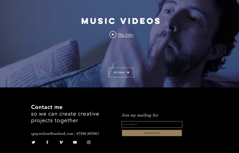
For the design it’s self I’d like to have a clean and uncluttered home page with a constant loop of my showreel at the top of the home page to showcase my pervious works. Under the showreel I’d like to have a short paragraph about me with a photo to make me seem more friendly and appealing to potential customers, as well as a short section about the production company to give some back sight about us. Underneath that I would like to have some small tabs showing the most recent work I have produced to show that the company is active. Finally I’d like a have my contact information. I want the website to be clear and easy to navigate so I would like tabs at the top of the home page that will direct viewers to different sections: “HOME” “PACKAGES” “ABOUT ME” “PORTFOLIO” “CONTACT ME” I want all of these pages to follow the same colour scheme as my logo apart from the portfolio page.
I hope to be in contact soon with you and look forward to creating a website with you, thank you for your time.
Kind Regards,
Charlie Guy-Wilson
CGW Films.
PART TWO
https://cguywilson.wixsite.com/cgw-flims


PART THREE
I think my website was successful in creating something that goes with my business plan, a production company that looks professional and high quality. As well as this I think I was successful in creating a website that goes with themes of my logo using the colour palette of light blues, blacks and whites. I also used a neon sign effect at the top of my page on the icons I did this to match some of the effects used on my logo, I really like the look this creates when placed next to my logo.
If I were to create my website again I would create an individual page for my portfolio showcasing all of my projects however I didn’t have the technical skills on WIX to create something like this. As well as this I wanted to put the videos I had uploaded to the website on a constant loop however I was unable to get this to happen again due to a lack of WIX skills. If I make a website in the future I would like to spend more time on learning how to use WIX.
Summary I am happy with the way the website turned out as it goes with the themes of my logo and business plan, however there are still some small details which I would change to make it perfect.
